Design Aspects
Overview
The key design aspects of the Elements C++ GUI library are:
Modular: Elements is very lightweight and extremely modular, facilitating the composition of fine-grained, flyweight, and reusable ``elements'' into complex element hierarchies. This is achieved through a declarative interface with heavy emphasis on reuse, allowing developers to build sophisticated GUI structures efficiently.
Declarative: Elements exposes a declarative API using modern C++. Declarative C++ code tells you what rather than how (contrasting with imperative programming which involves control flow). There are no code generators. The GUI is declared entirely in C++ code. After a while, code reuse, using a palette of fine-grained elements, becomes very familiar and intuitive, much like using HTML.
Interoperable: Elements is usable in any application and plays well with other GUI libraries and frameworks. The library is loosely coupled with the application and windowing system and can co-exist with components within a host. It should be easy to integrate Elements with any existing application.
This document will demonstrate the modular and declarative design aspects of the Elements library through examples.
Minimal Example
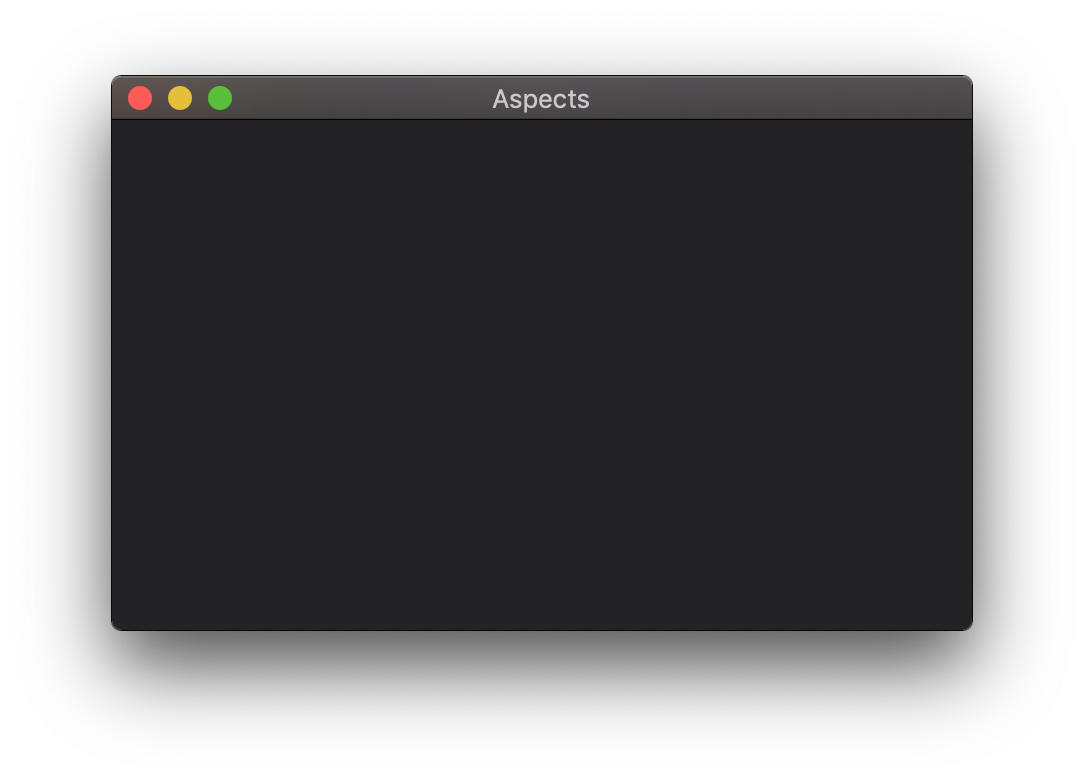
Specific examples should make it clear. Let’s start with a basic window with a dark grey background.
| The examples presented here can be found in this link: https://github.com/cycfi/elements/tree/master/examples/doc_aspects |
#include <elements.hpp>

using namespace cycfi::elements;

// Main window background color
auto constexpr bkd_color = rgba(35, 35, 37, 255);
auto background = box(bkd_color);

int main(int argc, const char* argv[])
{
   app _app(argc, argv);
   window _win(_app.name());
   _win.on_close = [&_app]() {_app.stop();};

   view view_(_win);

   view_.content(
      background
   );

   _app.run();
   return 0;
}
App and Window
Here, we create an app and a window, and set the window’s on_close to
stop (quit) the application. _win.on_close is called when the window is
closed by the user, thereby quitting the application.
Like any other GUI library or framework, the app manages the main event
loop, while the window manages application windows. However, take note that
the app and the window classes are optional. There are certain
situations, like e.g. building plugins or incorporating Elements in another
framework such as QT, where you do not want Elements to manage the event loop
or windows. The important class of interest here is the view. In these
cases, you want to embed the view directly. You can directly construct a
view given a platform window (or widget), as its main content view or
child window (or widget).
The view does not know anything about drawing or user interaction. Instead,
it relies on its client supplied content to do these. Without any
content, it is an empty shell. And so this is where it starts to get
interesting. The content of the view typically contains multiple layers,
much like typical graphics applications. In this example, we only have one
layer: the background.
Background
auto background = box(bkd_color);It is a simple, infinitely resizable box with the specified color:
rgba(35, 35, 37, 255). It will resize automatically when the window is
resized. We set it as the view’s content:
view_.content(
   background
);
Running this example, you get:
Aligns and Sizes
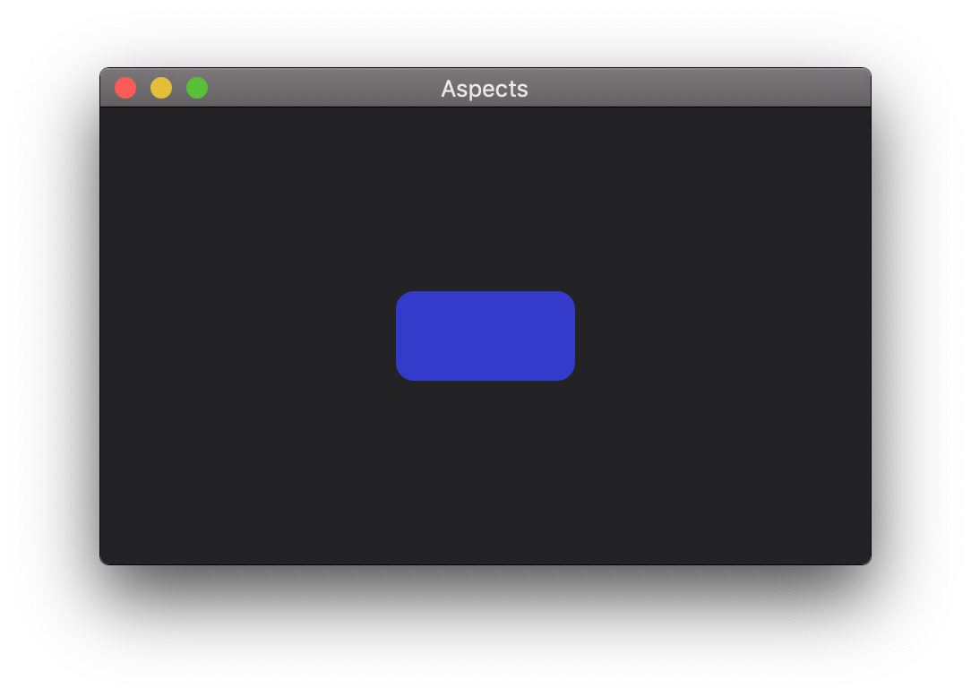
Now let’s add a blue round rectangle. We’ve seen how to create a box: the
background using box, passing in a color. A rounded box is created using
rbox, passing in the color and the corner radius:
auto blue_rbox = rbox(colors::medium_blue, 10);The color, this time, is specified by name from the colors namespace. The
namespace includes all predefined colors from the
standard HTML Color Names.
We can actually use blue_rbox already, as-is, by placing it in another
layer in the view:
view_.content(
   blue_rbox,
   background
);
But like the box, the rbox is infinitely resizable and will hog the
entire window. What we want is to give it a specific size and center it in
the window. Elements are very lightweight. Most elements do not even have a
size, nor know their position in the view (elements without position
information are inherently relocatable —they can be placed anywhere; the
position is supplied at rendering time).
So we give it a 100x50 size by wrapping it in the fixed_size element:
auto blue_rbox =
   fixed_size(
      {100, 50},
      rbox(colors::medium_blue, 10)
   );
And then we align it centered (in the x axis) and middle (in the Y axis)
using the align_center_middle element:
auto blue_rbox =
   align_center_middle(
      fixed_size(
         {100, 50},
         rbox(colors::medium_blue, 10)
      )
);| Without the alignment element, the main window would have been constrained to a fixed 100x50 size. There’s a multitude of alignment elements available. See Layout. |
So now, we are seeing how fine-grained elements are composed. The rbox is
placed inside the fixed_size element which is then placed inside a
align_center_middle element.
Let’s run this example:
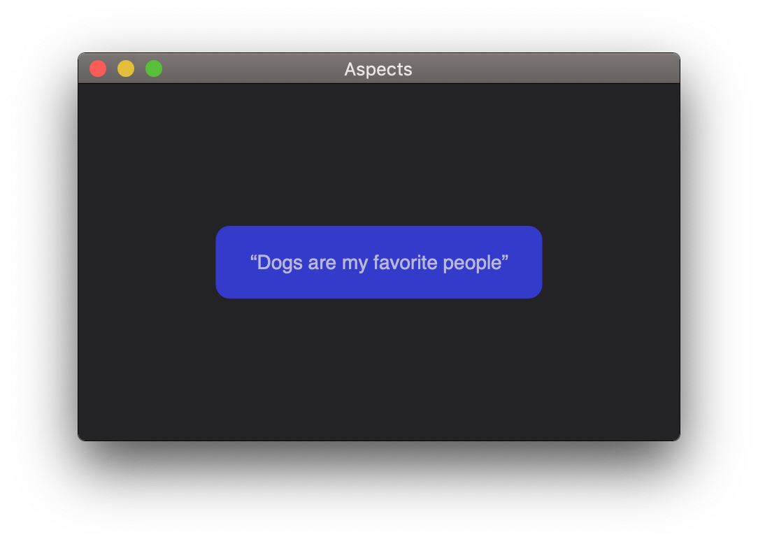
Labels, Margins and Layers
Our goal this time is to place some text inside the blue box. The element we
will use is the label. Most elements do not have a size, but as an
exception, labels (simple text elements) do. So, instead of fixing the size
of the box using fixed_size, we place the label alongside the box in a
layer element, but add some margin around the label. Here’s how you do it:
auto blue_rbox =
   align_center_middle(
      layer(
         margin(
            {25, 20, 25, 18},
            label("“Dogs are my favorite people”")
         ),
         rbox(colors::medium_blue, 10)
      )
   );
If it’s not obvious yet, let’s take it apart into its constituent pieces:
Step 1: We make a label:
label("“Dogs are my favorite people”")Step 2: We add margin around it:
margin(
   {25, 20, 25, 18},
   label("“Dogs are my favorite people”")
)
Note that like the align elements, there’s a multitude of margins such as
left_margin, right_margin, etc.
Step 3: We make a blue rounded box:
rbox(colors::medium_blue, 10)Step 4: We place the label and the blue rounded box as siblings in a layer
element:
layer(
   margin(
      {25, 20, 25, 18},
      label("“Dogs are my favorite people”")
   ),
   rbox(colors::medium_blue, 10)
)
Step 4: Then finally, we place it in the align_center_middle element.
If the element hierarchy gets a bit too deep, use the C++ auto to name
sub-parts of the element composition to make it easier to understand.
|
The layer element is a composite element that holds zero or more child
elements. Some of you might have noticed that we already mentioned the
layer element before when we were discussing the view’s content in the
App and Window section: `The content of the `view
typically contains multiple layers, much like typical graphics
applications''. Well, actually, this is the same layer thing here. The
view’s main content is a layer element.
So now we have:
Let’s Make a Slider
To demonstrate the fine-grained and modular nature of Elements, it is perhaps illustrative to say that many components in Elements, including the slider element, are not atomic and are actually composed of smaller parts. In this section, we will see how one creates a slider from the basic parts that we have dealt with in the previous sections.
Take note that this example is only for illustrative purposes. The library provides easier ways to make sliders. Elements has a collection of pre-made, reusable element compositions, just like what we do here, but more refined. That collection is constantly growing. Composing elements is fun!
The slider has two parts: the track and the thumb. Here, we make a
simple track using the same old box. We made it black. Then, we reused the
same "Dogs are my favorite people" label for the thumb. The result looks
silly, I should say, but hey, we are trying to make a point!
auto track = hsize(10, box(colors::black));
auto thumb =
   layer(
      margin(
         {25, 20, 25, 18},
         label("“Dogs are my favorite people”")
      ),
      rbox(colors::medium_blue, 10)
   );

auto funny_slider = slider(thumb, track);
And here it is in action:
Now, like before, we add our funny slider to our view:
   view_.content(
      align_center(funny_slider),
      background
   );
But note that, in this case, we want to center the slider only
horizontally, so we use align_center instead of align_center_middle.
Ok, there you go! Now go and be creative and make your own controls!
Here’s the complete prgram:
#include <elements.hpp>

using namespace cycfi::elements;
using cycfi::artist::rgba;
namespace colors = cycfi::artist::colors;

// Main window background color
auto constexpr bkd_color = rgba(35, 35, 37, 255);
auto background = box(bkd_color);

auto track = hsize(10, box(colors::black));
auto thumb =
   layer(
      margin(
         {25, 20, 25, 18},
         label("“Dogs are my favorite people”")
      ),
      margin(
         {5, 5, 5, 5},
         rbox(colors::medium_blue, 10)
      )
   );

auto funny_slider = slider(thumb, track);

int main(int argc, char* argv[])
{
   app _app("Aspects");
   window _win(_app.name());
   _win.on_close = [&_app]() { _app.stop(); };

   view view_(_win);

   view_.content(
      align_center(funny_slider),
      background
   );

   _app.run();
   return 0;
}
Copyright (c) 2014-2024 Joel de Guzman. All rights reserved. Distributed under the MIT License